Tuesday 20 September 2011

More Book Covers

This website has hundreds of examples of book cover designs that range from mediocre to awe inspiring. A few of these book fronts can be seen below.


Jillian Tamaki

This particular artist is the perfect example of a designer who has made a career re-imagining book covers. Below are just a few examples of her work. I'm not personally a fan of the sewed look, but the designs and compositions work very well and you can't deny the vibrancy and impact of the imagery.


Thursday 8 September 2011

Blake Suarez

There are many pieces of design on Blake Suarez's website that interest me, but the one shown here is probably my favourite. I love the use of a vibrantly coloured background and a lighter colour used for the actual design, almost as if the image is reversed. The fact that the illustration was designed for a popular music band just adds to the appeal of the artist. Daniel Suarez is someone who I will be keeping an eye on.

Daniel Kent

Daniel Kent's website details all the work he has masterfully created in his recent career, the majority of which has been hand crafted such as screen printed posters and letter pressed stationary seen in the image to the left. In regards to all his work I would have to say that the range of items seen in the picture is my favourite example. I admire the thorough resolution to the brief, and the expansive range of items created all based around one initial design. I also enjoy the colour scheme and the combination of blues and reds mixed with a very interesting stock choice. It's amazing how much texture can be communicated with 2D design.

Aaron Scamihorn

The work of Aaron Scamihorn is very interesting to me. His compositions are retro in style and the subject matter is often related to popular culture. The image to the left is taken from Aaron's first solo gallery show entitled 'Freaks & Geeks'. The intention behind the show was to exhibit Aaron's love for portraiture mixed with interesting and unique faces, and I would say it is a resounding success. Though Aaron is technically a fine artist with all the portraits in the show being hand rendered, his process is incredibly interesting. He actually combines hand painting with screen printing, but most importantly states that the origin of all the pieces is computer based. Therefore his work could be considered graphic design, and qualifies as an inspiration for me.

The rest of his amazing work can be found here.

Chelsey Scheffe

Originally a fine artist, Chelsey Scheffe is slowly becoming an accomplished designer. Her visual approach to briefs is unique and without doubt identifiable as her own. There are many positives to Chelsey's work, including her detailed illustrations and use of geometric shapes and subtle compositions. However on her website there are many categories of work including; print, web, motion and photography. She may be able to juggle all these different areas of design, but on a personal note I would not want to. Seeing all those disciplines makes me realise the importance of excelling in just one, or at a stretch two, areas of design.


Wednesday 7 September 2011

Bandito Design Co.

Bandito Design Co. is the brainchild of Ryan Binkerhoff. I was originally drawn to the designer through the work he created for the 'Pee Wee Herman' show at Gallery 1988. However when I visited his website I discovered the rest of his work and was blown away by his bold illustrations. His simple style is similar to that of many other designers in industry right now, but there is something more striking about his work. It seems to stand out that bit more, probably due to the bright colours he chooses to print with. Whatever it is, Ryan is a personal inspiration and more of his work can be found here.


Nathan Stapley

I absolutely adore the work of Nathan Stapley and if I had a large amount of money to spend, I would buy one of his many prints. They are incredibly intricate and without doubt one of the best examples of pop culture referencing. His work is not entirely graphic, but his influence can be felt nevertheless.

left: '18 Dads'


left: Baseball Bonanza 


left: The Ramones meet The Warriors

Ben Chlapek

Ever since the summer I have been fascinated by the Wet Hot American Summer 'Camp Firewood' show at Los Angeles' Gallery 1988. I have been tracking down all the artists that had pieces displayed and trying to make a connection. I failed to identify Ben Chlapek as the designer of the poster to the left initially, but now I know I have become well versed in all his previous work. I love his hand drawn illustrations mixed with pop culture references and the often sparse compositions. His use of neutral colours for the backgrounds is also inspired, meaning the lines on the page really pop. It's amazing how something so minimal can have so much of an impact.

Tuesday 6 September 2011

Radio

There's not much I can say about the posters below, just wow.


Saul Bass: A Life in Film & Design

Great news for anyone who has an interest in Saul Bass! it's hard to believe that this is the first book to ever be created that compiles the many works of Bass. His career spanned for decades and the impact of his poster designs can still be felt today. His visual aesthetic was unique and one hundred per cent original when he started collaborating with Hitchcock, but now his style is emulated by thousands of designers the world over. Myself included. This book will definitely be within my collection sooner rather than later, now I just have to find the money.

A few of the page spreads can be found below and more info on the whole project here.


Nate Utesch


Nate Utesch is a young designer from Northeast Indiana, America. His work has a clear aesthetic and is therefore easily identified as his own. He has designed for a wide ranging list of clients and has featured in many publications including the one shown above; 'Ferocious Quarterly'. It is a small publication available for purchase in only a select few locations around the US, however this does not degrade the credibility and all round quality of the publication. It is through mediums like this that up and coming artists are getting their names out there, perhaps this is something I should look further into.

Timo Meyer

German born illustrator Timo Meyer is an up and coming designer who I discovered through his work for 'Silver Screen Society'. The poster shown to the left was his attempt at re-imaging the film 'The Third Man' and communicates his unique approach to interpretation. I'm not sure if his attempt is one of the best I have seen, but after browsing through the rest of his work I have come to admire his aesthetic. His work has been featured on many websites I visit daily including /Film and Wired, and therefore he must be some sort of inspiration for me. He also has several other projects that are film orientated, with a personal favourite being a 80's inspired cult film illustration. This man is a great example that proves people with similar interests and a design style can make it in the design world.

Maxime Francout

If the designs of Maxime Francout seem familiar that's because he has worked for high profile clients such as Urban Outfitters and had his work produced on Threadless. However I chose to look at the pieces of design to the left, primarily because of the unique medium. Not many designers get to create visuals that will be applied to skateboards. However I think it's a really interesting medium and definitely something to consider for myself. I have always had an interest in sportswear and think that snowboard design is another viable option for a creative outcome. Apart from the medium I also enjoy the unique illustrative aesthetic and bright, yet limited, colour schemes seen on the boards.

Chris DeLorenzo

Chris DeLorenzo is actually the head designer at Johnny Cupcakes Inc. Perhaps it is a failure on my behalf that I did not know this, but now I have discovered his work I will definitely remain up to date with his latest creations. There are many examples of his designs on his webpage but I particularly liked the one found below. I like the fact that it is technically packaging design, and the thorough completion of the project with both front and back cover designs and the CD itself created. I also admire the combination of type and image, the colour scheme and the simple illustrative style. Whether or not the visuals fit with the genre of music I am not sure, for I have never heard of Lyle Brewer, but with Chris being such an accomplished designer I'm sure they do. More work here.


Lydia Nichols

Whilst scouring the internet I came across the work of Lydia Nichols. I couldn't tell you exactly what it is that appeals to me so much, perhaps Lydia states it best when she says her work 'strives to be narrative while remaining concise and simple'. This is the perfect way to describe her visual style, which is evident in the image to the left. Again a re-imagined poster design for 'O Brother, Where Art Thou?', this one has a slightly different feel than Trevor Basset's. More elements of the film's plot are on display, and the arrangement of these elements is perfect. The success of this poster is determined by how it communicates the message with such simple vector illustrations.

Monday 5 September 2011

Joe Van Wetering

Taken from the about section of Joe Van Wetering's website: 'Inspired by the contrasting visions of pop culture and nature, Joe explores the continuously developing relationship between color and space, creating abstract visions of everyday life through his artwork.'

This sounds very similar to what I aim to create with my designs. Perhaps I should keep an eye on this designer in the future, that way I am constantly reminding myself of the ethos I wish to work to.


Cory Schmitz


Cory Schmitz is an artist who is establishing himself in the graphic design community steadily but surely. His work is visually engaging, and ranges from simple 2D poster design to surface pattern design for clothing items, such as seen in the image above. He also designs typefaces and creates and publishes his own 'video game art & culture' magazine. This is quite an impressive range of projects undertaken and therefore shows his versatility. Perhaps I should consider expanding my own horizons, that way I can become as successful as Cory is becoming. His website is a great way to waste some time.

Trevor Basset

The third and final designer to establish 'Silver Screen Society' is Trevor Basset. Again his work fits within the same criteria as the two previously mentioned artists, but again his visual approach is slightly different. His take on poster design seems a lot more hand rendered, with intricate designs abandoned in favour of simple, humourous illustrations. The poster to the left has been designed for 'O brother, Where Art Thou?', and as a major fan of the film I can contest that it is a funny, and unique interpretation of a memorable Coen Brothers creation.

More work of the same nature can be found here.

Brandon Schaefer

Another designer who regularly contributes to 'Silver Screen Society' is Brandon Schaefer. His work is slightly different to that of previously mentioned Adam Hanson, but is just as effective at communicating the intended message. His designs are often less colourful, and instead he works with black, white and mid-tones of grey. The poster shown to the left is a superb example of well considered/executed poster design. It is simple, subtle and is perfect for fans of the film. The 'private joke' almost acts as a barrier for non film fans. However it is possible to still enjoy the poster without understanding what has been illustrated. I also like how a wider variety of work can be found on his website, with examples of logo and album art on display.

More Brandon.

Adam Hanson

When I was searching for artists who specialise/participate in design for film, one of the first people I came across was Adam Hanson. He regularly contributes to 'Silver Screen Society', but also designs for other mediums. After looking through his website I have come to realise that I really admire his strong visual style and consider it to be a more developed version of how I aim to design. His use of colour is exciting, and his bold line drawings lend themselves very well to both digital and screen printed production. The example shown here is a prime example of some of his best work.

For more click here.

R. Black

I knew I had found a relevant artist to my line of design as soon as I opened the home page on R. Black's website and was faced with this image:


Christina Ricci as Wednesday Addam's peeping through a key hole. Yes Please.

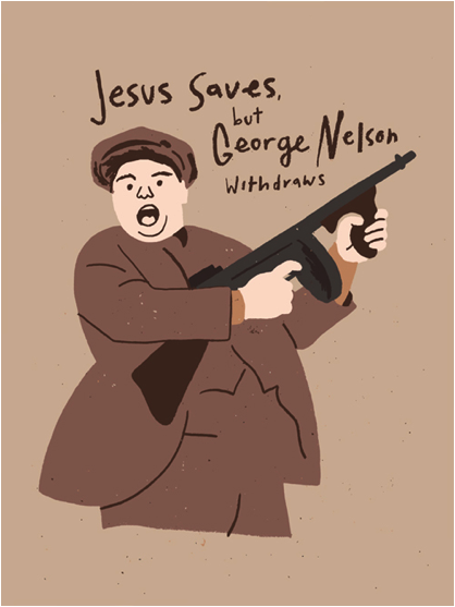
There's not much that can be said about R. Black's work that can't be identified the very moment you look at it. It's bold, colourful, vivid, striking, but most importantly, it is his. I have yet to come across a current graphic designer whose work is this visually strong. I know that If I were to see a piece of R. Black's work, completely out of context, I would be able to identify it as his and to me this is what makes a great designer. Creating a very clear visual approach is something I need to become better at. I need to establish myself and make my design intentions clear. I can learn a lot from this artist. Below are a few examples of Black's work that I am particularly fond of.


To view more of R. Black's poster artwork click here.


TrustoCorp


I was searching the internet, not looking for anything in particular, when I stumbled across the work of TrustoCorp. The first few examples of their work that I found where the spoof magazine covers found below, and I was blown away by the combination of bold, colourful imagery with popular culture. The designs are exactly what I look for when trying to find existing examples of work that I would love to emulate one day. I enjoy the private jokes, and I especially like how clever the word play is. All the headlines found on the range of covers are, believe it or not, only slightly exaggerated. In fact most of the stories you see have been printed in some form or another in one of these 'trash rags' in recent years.  


After finding the examples of work above I went on to research more into the work of TrustoCorp and was blown away with the coverage they are receiving at the moment. They have a whole campaign currently across the streets of America, primarily New York, with subtle imagery that is catching the attention of many, yet being overlooked by many more. To see more examples of TrustoCorp's work click here.


Thursday 1 September 2011

To Death with a Smile [live brief]

I found this live brief and thought it would be perfect for me. It combines my love of the mexican culture/ aesthetic style with my interest in poster design. I think this is definitely a contender for one of my negotiated briefs.